Introduction: Why Performance Metrics Matter (Beyond the Obvious)
So, you’ve built a machine learning classification model. You fed it data, watched it train, maybe even felt a flicker of parental pride. Now comes the inevitable, often uncomfortable question: “How good is this thing, really?” Answering that is fraught with potential self-deception if you aren’t careful.
At the heart of cutting through the bullshit lies the confusion matrix. It’s not fancy, it’s not AI-hype-cycle-worthy, but it’s fundamental. It’s the bedrock tool that forces us to confront precisely how our model gets things right and, more importantly, how it screws up. It breaks down performance into the raw components of truth and error.
From this simple grid, we derive the metrics that actually matter – precision, recall, F1-score, and others. Each tells a distinct story, revealing different facets of the model’s behavior. Blindly chasing “accuracy” is a fool’s errand; understanding these nuanced metrics is how you move from building toys to building tools with real-world consequences.
Let’s dissect the confusion matrix and figure out how to choose the right lens for your specific battle.
Understanding the Confusion Matrix: Facing the Facts
The confusion matrix is brutally simple: it pits your model’s predictions against the cold, hard ground truth. For a binary classification problem (two classes, like spam/not spam, fraud/not fraud), it’s a 2×2 grid. Here’s the typical layout:
| Predicted Positive | Predicted Negative | |
|---|---|---|
| Actual Positive | True Positive (TP) | False Negative (FN) |
| Actual Negative | False Positive (FP) | True Negative (TN) |
Let’s be clear about what each cell means:
- True Positive (TP): Your model correctly guessed “positive.”
- Example: Correctly flagging an email as spam. Good.
- True Negative (TN): Your model correctly guessed “negative.”
- Example: Correctly identifying a legitimate email as not spam. Also good.
- False Positive (FP): Your model guessed “positive,” but it was wrong. This is a Type I error. The model cried wolf when there was no wolf.
- Example: Annoyingly marking your important client email as spam. Bad.
- False Negative (FN): Your model guessed “negative,” but it was wrong. This is a Type II error. The wolf slipped past the guards.
- Example: Letting a phishing email land in the inbox, pretending to be legitimate. Potentially very bad.
The TPs and TNs are successes. The FPs and FNs are failures – and often, the nature of these failures is far more revealing than the successes. This matrix is the raw data; the metrics we derive are the interpretations.
Essential Evaluation Metrics: Different Tools for Different Jobs
From these four numbers (TP, TN, FP, FN), we can calculate metrics that offer specific insights. Don’t just grab the first one you see; understand what each measures.
1. Accuracy: The Overall Success Rate (Often a Trap)
Accuracy is the simplest: what fraction of predictions did the model get right overall? It feels intuitive, which is precisely why it’s dangerous. Accuracy is profoundly misleading on imbalanced datasets. If 99% of your emails are not spam, a stupid model that predicts “not spam” for everything achieves 99% accuracy, yet it’s completely useless at finding actual spam. It’s the vanity metric, the first refuge of the statistically naive.
When to even glance at it: Maybe if your classes are perfectly balanced and you genuinely believe all errors (FP and FN) have identical, negligible costs. Which is rare.
Real-world context: In that mythical balanced 50/50 spam scenario, accuracy tells you the overall hit rate. But reality is rarely that neat.
2. Precision: Minimizing False Alarms (When Crying Wolf is Expensive)
Precision asks a sharp question: “Of all the times my model yelled ‘Positive!’, how often was it actually right?” It focuses squarely on the reliability of the positive predictions. High precision means fewer false alarms.
When it’s critical: When the cost of a false positive is high. You don’t want to constantly bother users with false warnings, block legitimate transactions, or wrongly accuse someone.
Real-world example: For a spam filter, high precision means legitimate emails rarely end up in the spam folder. This builds user trust – they aren’t missing important messages because your filter is trigger-happy.
3. Recall (Sensitivity): Catching All Positives (When Missing is Unthinkable)
Recall flips the question: “Of all the actual positive cases out there, how many did my model manage to find?” It measures the model’s ability to detect the positive instances, its sensitivity.
When it’s critical: When the cost of a false negative (missing a positive case) is high. Letting a dangerous condition go undetected, missing a fraudulent transaction, failing to identify a security threat.
Real-world example: In medical screening for a serious disease, high recall is paramount. You’d rather have some false alarms (low precision) that require further investigation than miss an actual case (low recall), which could be catastrophic for the patient.
4. Specificity: Correctly Identifying Negatives (The Other Side of the Coin)
Specificity is recall’s counterpart for the negative class. It asks: “Of all the actual negative cases, how many did the model correctly identify as negative?”
When it matters: When correctly identifying negatives is a key goal, often to avoid unnecessary actions or costs associated with false positives.
Real-world example: In airport security, you want high specificity to avoid constantly stopping and searching innocent travelers (false positives), even while maintaining high recall for actual threats.
5. Negative Predictive Value (NPV): Trusting the “Negative” Prediction
NPV tells you: “When my model predicts ‘Negative’, how likely is it to be correct?” It measures the reliability of the negative predictions.
When it matters: When you need high confidence that a negative prediction truly means negative.
Real-world example: For a diagnostic test like COVID-19, a high NPV gives individuals confidence that a negative result means they are likely infection-free.
Balancing Precision and Recall: The Inescapable Trade-off
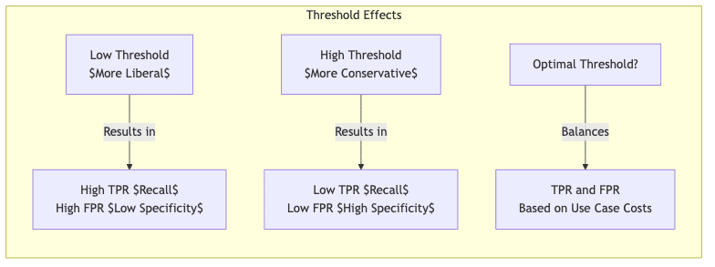
Here’s the rub: Precision and Recall live in constant tension. Tune your model to be more aggressive in flagging positives (lower the decision threshold), and recall will likely go up (you catch more positives), but precision will probably drop (you make more false alarms). Tune it to be more conservative (higher threshold), and precision might rise (fewer false alarms), but recall will likely fall (you miss more actual positives).
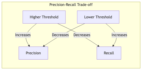
This isn’t just a technical quirk; it’s often an economic or strategic decision. You have to decide which kind of error hurts more in your specific context. Metrics that try to balance these two are crucial.
1. F1-Score: The Harmonic Mean Compromise
The F1-score is the harmonic mean of precision and recall. Why harmonic? Because unlike a simple average, it heavily penalizes models where one metric is high and the other is very low. It forces a compromise. A model with 0.9 precision and 0.1 recall gets a much lower F1 than one with 0.5 precision and 0.5 recall.
When to use: When you need a single number that reflects a balance between precision and recall, particularly if the dataset is imbalanced or the costs of FP and FN are somewhat comparable (though maybe not identical).
Real-world example: Fraud detection often uses F1. You want to catch fraud (high recall) but not block so many legitimate transactions that customers get angry (high precision). F1 tries to find a reasonable middle ground.
2. Balanced Accuracy: Giving Imbalance Its Due
Balanced accuracy averages the recall (sensitivity) of the positive class and the recall of the negative class (specificity). This is vital for imbalanced datasets because it gives equal weight to performance on both the rare and common classes. It prevents the model from getting a high score just by ignoring the minority class.
When to use: When your classes are heavily skewed, and you care about performance on both classes, not just the majority one.
Real-world example: Detecting a rare disease. Most people don’t have it. A naive model predicting “no disease” for everyone gets high accuracy but zero recall and is useless. Balanced accuracy correctly penalizes this behavior.
Practical Implementation in Python: Getting Your Hands Dirty
Enough theory. Let’s see how scikit-learn makes calculating this stuff straightforward.
import numpy as np
import matplotlib.pyplot as plt
from sklearn.metrics import confusion_matrix, classification_report
from sklearn.metrics import precision_score, recall_score, f1_score, balanced_accuracy_score
import seaborn as sns

# Example: Ground truth and model predictions
y_true = np.array([1, 1, 0, 0, 1, 0, 1, 1, 0, 0]) # 1=Positive, 0=Negative (5 Pos, 5 Neg)
y_pred = np.array([1, 0, 0, 0, 1, 1, 1, 0, 0, 1]) # Model's guesses

# Compute and visualize the confusion matrix
cm = confusion_matrix(y_true, y_pred)
print("Confusion Matrix:")
print(cm) # [[TN, FP], [FN, TP]] format by default

# Compute key metrics
precision = precision_score(y_true, y_pred)
recall = recall_score(y_true, y_pred)
f1 = f1_score(y_true, y_pred)
bal_acc = balanced_accuracy_score(y_true, y_pred)

print(f"\nKey Metrics:")
print(f"Precision: {precision:.2f}")
print(f"Recall (Sensitivity): {recall:.2f}")
print(f"F1 Score: {f1:.2f}")
print(f"Balanced Accuracy: {bal_acc:.2f}") # Note: For balanced data, Balanced Accuracy often equals Accuracy

# Complete classification report for a fuller picture
print("\nClassification Report:")
print(classification_report(y_true, y_pred))

# Optional: Visualize the confusion matrix - often helps to SEE the errors
plt.figure(figsize=(8, 6))
sns.heatmap(cm, annot=True, fmt='d', cmap='Blues',
            xticklabels=['Predicted Negative', 'Predicted Positive'],
            yticklabels=['Actual Negative', 'Actual Positive'])
plt.ylabel('Actual Label')
plt.xlabel('Predicted Label')
plt.title('Confusion Matrix')
plt.show()
Sample Output and Interpretation: What the Numbers Mean
The confusion matrix from our example:
[[3 2]  # Actual Negative: 3 TN, 2 FP
 [2 3]]  # Actual Positive: 2 FN, 3 TP
This tells us directly:
- True Negatives (TN): 3 (Correctly identified negatives)
- False Positives (FP): 2 (Incorrectly called negative cases positive)
- False Negatives (FN): 2 (Missed actual positive cases)
- True Positives (TP): 3 (Correctly identified positives)
From these raw counts, scikit-learn calculates:
- Precision: 0.60 (3 TP / (3 TP + 2 FP) = 3/5). When the model predicted positive, it was right 60% of the time. 40% were false alarms.
- Recall: 0.60 (3 TP / (3 TP + 2 FN) = 3/5). The model found 60% of the actual positive cases. It missed 40% of them.
- F1 Score: 0.60 (The harmonic mean reflects the identical precision and recall here).
- Balanced Accuracy: 0.60 (Sensitivity=0.60, Specificity=TN/(TN+FP)=3/(3+2)=0.60. Average is (0.60+0.60)/2 = 0.60).
Seeing the raw counts in the matrix and relating them to the calculated metrics is key to truly understanding performance. Visualization makes the distribution of errors even clearer.
Beyond Binary Classification: When the World Has More Than Two Flavors
Life isn’t always binary. Confusion matrices scale naturally to multi-class problems (classifying images into 10 categories, predicting one of 5 customer segments, etc.). If you have ‘n’ classes, the matrix becomes n×n.
In a multi-class matrix:
- The diagonal (top-left to bottom-right) shows correct predictions (TPs for each class relative to all others).
- Off-diagonal cells show the confusion – where the model made mistakes. The cell at (row i, column j) tells you how many times an actual class ‘i’ was incorrectly predicted as class ‘j’.
This is incredibly useful for debugging. It tells you exactly which classes your model is struggling to distinguish (e.g., consistently confusing handwritten ‘4’s with ‘9’s, or labeling wolves as husky dogs).
ROC Curves and AUC: Evaluating the Engine Under the Hood
Most classifiers don’t just spit out a binary prediction; they output a probability or score. A threshold is then applied (often 0.5 by default) to make the final call. The Receiver Operating Characteristic (ROC) curve lets us evaluate model performance across all possible thresholds.
- X-axis: False Positive Rate (FPR = FP / (FP + TN) = 1 – Specificity)
- Y-axis: True Positive Rate (TPR = Recall)
- Each point on the curve represents the FPR/TPR trade-off for a specific threshold.
The Area Under the Curve (AUC) boils the entire ROC curve down to a single number between 0 and 1.
- AUC = 1.0: A perfect classifier (can achieve 100% TPR with 0% FPR).
- AUC = 0.5: Useless. Performance is no better than random guessing.
- AUC < 0.5: Worse than random. The model’s predictions are systematically backward (inverting them might help!).
AUC is valuable because it measures the model’s ability to discriminate between classes regardless of the chosen threshold. It’s great for comparing the inherent ranking power of different models, especially when the optimal operating threshold might change later or isn’t known upfront. However, don’t only look at AUC – the specific operating point (threshold) chosen for deployment still determines the real-world precision and recall.
from sklearn.metrics import roc_curve, auc

# You need predicted probabilities for ROC, not just 0/1 predictions
# In a real scenario: y_prob = model.predict_proba(X_test)[:, 1]

# Using our binary example, let's simulate some probabilities
# that might have led to the y_pred we used earlier (assuming threshold=0.5)
y_prob = np.array([0.9, 0.3, 0.2, 0.1, 0.8, 0.7, 0.9, 0.4, 0.2, 0.6]) # Example probabilities

# Calculate ROC curve points and AUC
fpr, tpr, thresholds = roc_curve(y_true, y_prob)
roc_auc = auc(fpr, tpr)

# Plot ROC curve
plt.figure(figsize=(8, 6))
plt.plot(fpr, tpr, color='darkorange', lw=2,
         label=f'ROC curve (area = {roc_auc:.2f})')
plt.plot([0, 1], [0, 1], color='navy', lw=2, linestyle='--', label='Random Guessing') # Baseline
plt.xlim([0.0, 1.0])
plt.ylim([0.0, 1.05])
plt.xlabel('False Positive Rate (1 - Specificity)')
plt.ylabel('True Positive Rate (Recall)')
plt.title('Receiver Operating Characteristic')
plt.legend(loc="lower right")
plt.show()
Choosing the Right Metric: It Depends Entirely On What Breaks
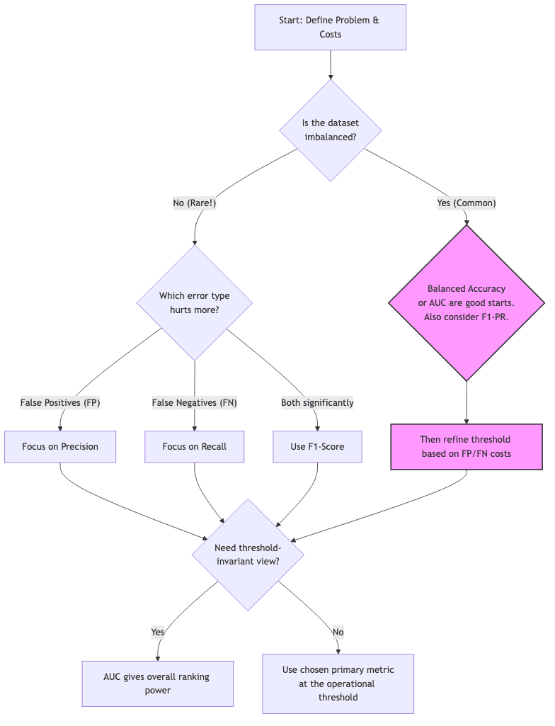
Selecting the right evaluation metric isn’t an academic exercise; it’s about aligning your measurement with the consequences of your model’s errors in the real world. What happens when it’s wrong? How much does it cost?
| If the biggest pain is… | Focus your attention on… | Think… |
|---|---|---|
| False alarms (wasted effort, user annoyance) | Precision | Spam filter, content moderation |
| Missed cases (danger, lost opportunity) | Recall | Cancer screening, critical alert systems, fraud detection |
| Needing a mix of both | F1-score | Recommendation systems, sentiment analysis |
| Highly skewed data & caring about both classes | Balanced accuracy, AUC | Rare event detection, anomaly identification |
| Needing the full error breakdown | Full confusion matrix | Deep debugging, detailed analysis |
Application-Specific Reality Checks
- Medical diagnosis: Missing cancer (low recall) can be fatal. Treating someone unnecessarily based on a false positive (low precision) has costs and side effects. The balance is critical and context-dependent.
- Content moderation: High precision is vital to avoid censoring legitimate speech and eroding trust. High recall is needed to catch genuinely harmful content. Another balancing act.
- Fraud detection: Letting fraud through (low recall) costs money directly. Blocking legitimate transactions (low precision) costs customer goodwill and potentially business. F1 is often a starting point.
- Manufacturing Quality Control: Is it worse to discard a good item (FP cost) or ship a faulty one (FN cost)? The answer dictates whether precision or recall dominates.
Conclusion: From Numbers to Insightful Decisions
The confusion matrix is a mirror reflecting your model’s interaction with reality. Its derived metrics are lenses, each offering a different, crucial perspective. No single number captures the whole truth.
When you evaluate your next classifier, resist the siren song of simplistic accuracy:
- Start with the confusion matrix. Stare at the raw TP, TN, FP, FN. Where are the errors piling up?
- Quantify the costs. What is the actual impact of a false positive versus a false negative in your specific application? Be honest.
- Select primary metrics that align with those costs. Don’t optimize a metric just because it’s fashionable; optimize for reduced pain or increased value.
- Use ROC/AUC to understand the model’s underlying capability across thresholds, but remember you must eventually choose an operating point.
- Communicate clearly. Explain to stakeholders why you chose certain metrics and what the results mean in terms of business impact or risk.
Mastering these evaluation tools moves you beyond just building models that score well on benchmarks. It enables you to build models that make the right kinds of mistakes for the problem at hand, acknowledging the trade-offs and delivering tangible, defensible value in a messy world. That’s the difference between coding and engineering.